Projects tagged “Growth-design”
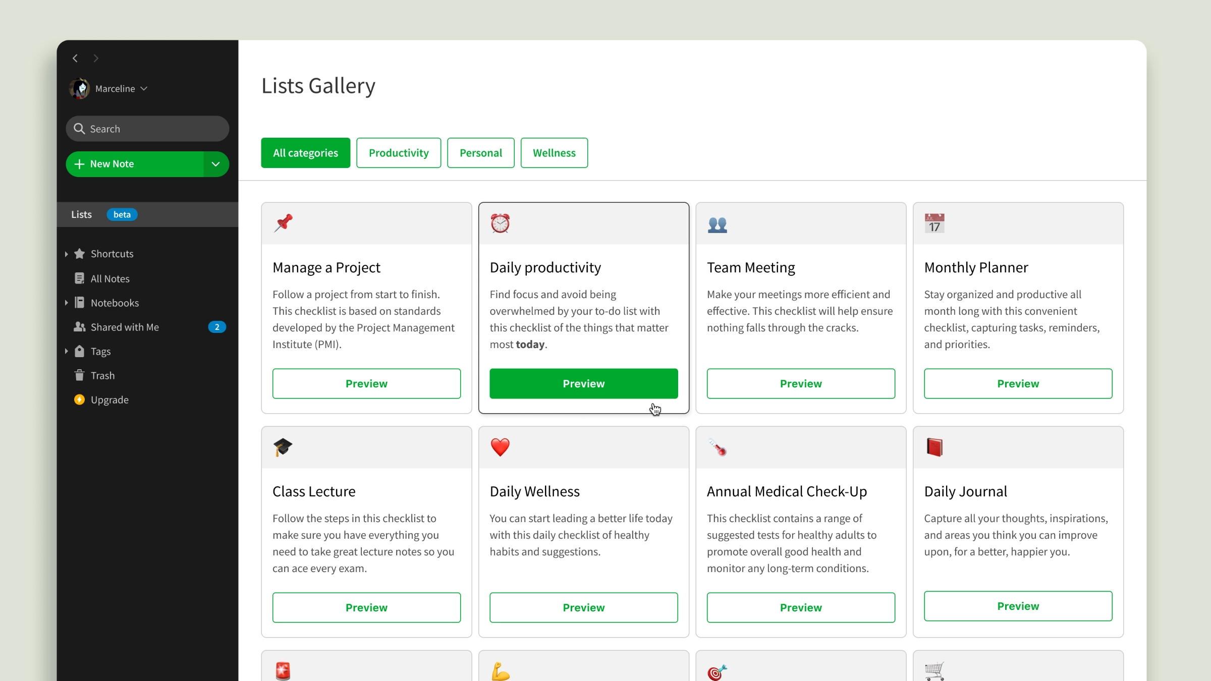
Designing for Growth at Evernote
A selection of work for acquisition, activation, monetization
A Head of Growth, two Product Managers, three Designers, a Design Manager, and two dedicated Engineering teams with a Lead each. Meet Evernote’s GET, the Growth Experiments Team. As a first-time Growth Designer, this was the most supportive environment I could have asked for. I learned a lot from the divide-and-conquer approach practiced by the designers, relying on their expertise and an invaluable, detailed, searchable archive of fully documented experiments. Here’s a taste of the work I did there. Happy to chat more about it!
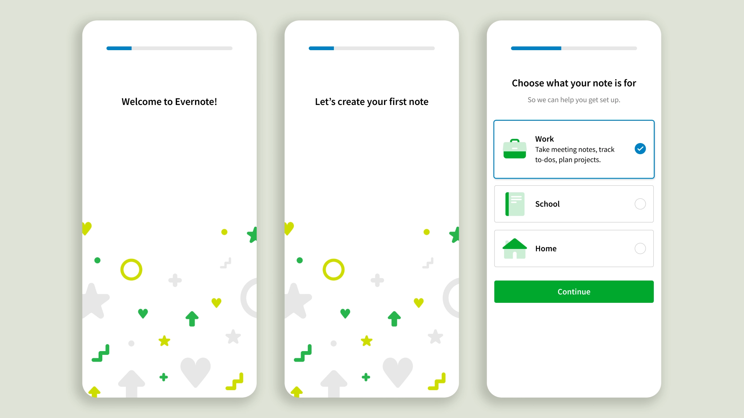
Becoming a loyal Evernote note-taker
Onboarding personalization for a successful first-day activation
With increased competition from pre-installed note apps, Evernote took the activation challenge very seriously. At the time I joined the Growth Design team, experiments had corroborated the hypothesis of personalization as a lever for onboarding engagement. I contributed to the design of a Web client test, an effort leading to a 17% activation lift. After that, I took over the lead role, bringing personalization to the apps’ onboarding. The stakes on mobile were higher. It drove the majority of acquisition traffic but offered less real estate, the feature set was different, and app users’ attention is shorter, giving us just a handful of seconds to make a lasting impression. I deliberately softened the first part of the onboarding to guide users to create their first note without pressure. The experience is brief and drops users in front of features relevant to the use case they chose, rather than asking them to explore every knob of Evernote’s editor to figure out what it could do for them, as the old flow did.
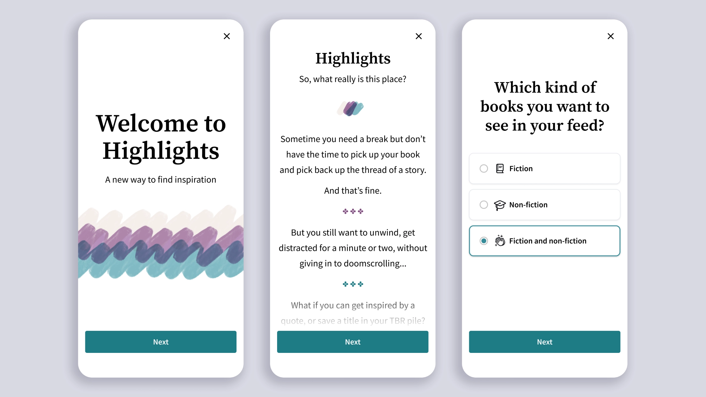
Highlights, mobile designs for a book-quotes feed
Exploring social reading as an acquisition space
A few days into my new role at Scribd, I jumped on the Hack Week wagon and joined a team with an idea that needed a designer: turning book highlights into a feed. Recently I took those early sketches and gave them more thought and time, to see what a more mature prototype could look like. If you’re into books, you know social media has its bookworm corners of influencers curating pages and recommending titles, but there isn’t anything yet uniquely dedicated to books. Scribd (now Everand) didn’t develop the idea further, but I‘m still fascinated by its potential.
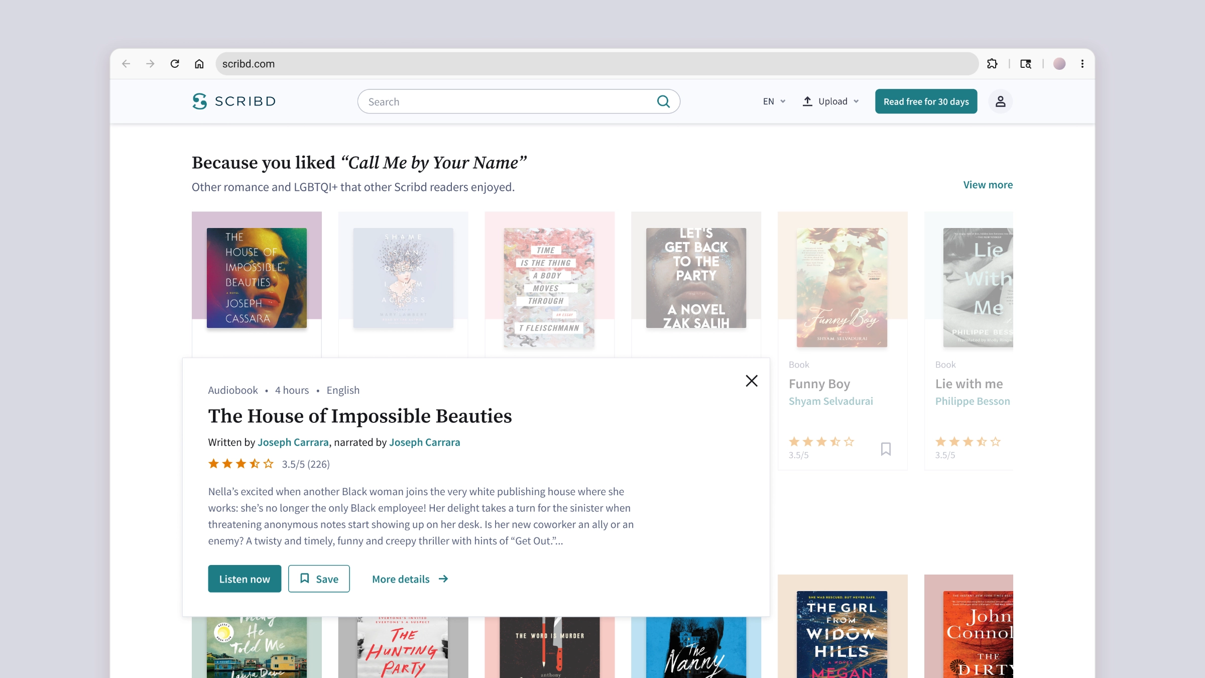
Design variants for a quick view component
Exploring interactions to turn an experiment into a core feature
This is one of those quick requests that can drop at any designer’s desk. A senior designer was moving into a manager position and asked me to explore visual design variants and interactions for a winning experiment that needed to be productized. The original design was a quick view panel for getting more information about a Title (book, audiobook, document, and so on), letting users better pick content without leaving the page they were on. We ended up choosing the safest route, building a component very close to the original designs. That said, I quite like some of my experiments, and I think they show how I approach interaction design and motion.
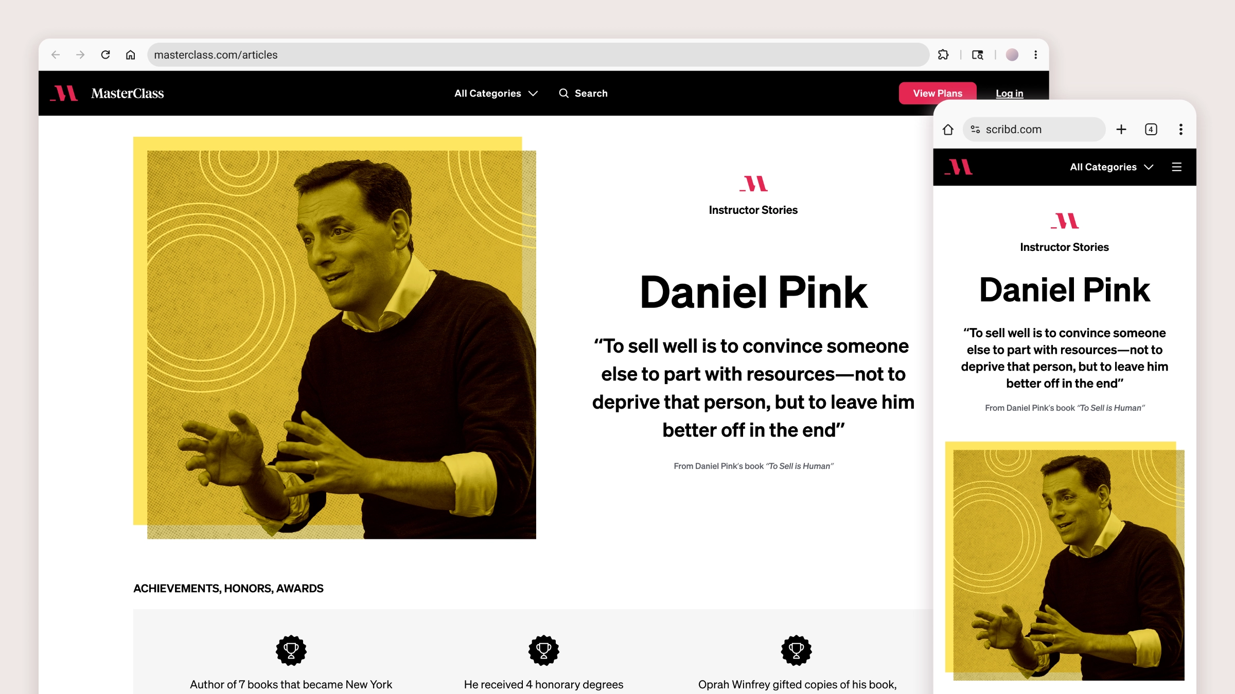
Using immersive reading for SEO acquisition
Editorial design for MasterClass’ Instructor Pages and Articles
At the time I joined the team, a new Product Manager was taking the lead on rebuilding MasterClass’ SEO strategy, moving away from the simplistic approach of publishing as many Articles as possible. Loosely connected to the platform’s offering, all Articles shared one template with a brief text randomly interrupted by promos and CTAs trying to divert readers’ attention toward the subscription. The Product Manager wanted stronger alignment with both the brand and the audience. He kicked things off with Instructor Pages, a new format of SEO articles telling the compelling stories of MasterClass’ popular instructors, with the goal of ranking high on SERPs and drawing higher-intent traffic. My task was to design a new template where immersive reading would organically lead into conversion, with the possibility of reusing and adapting the new layout and components to retrofit the older Articles.
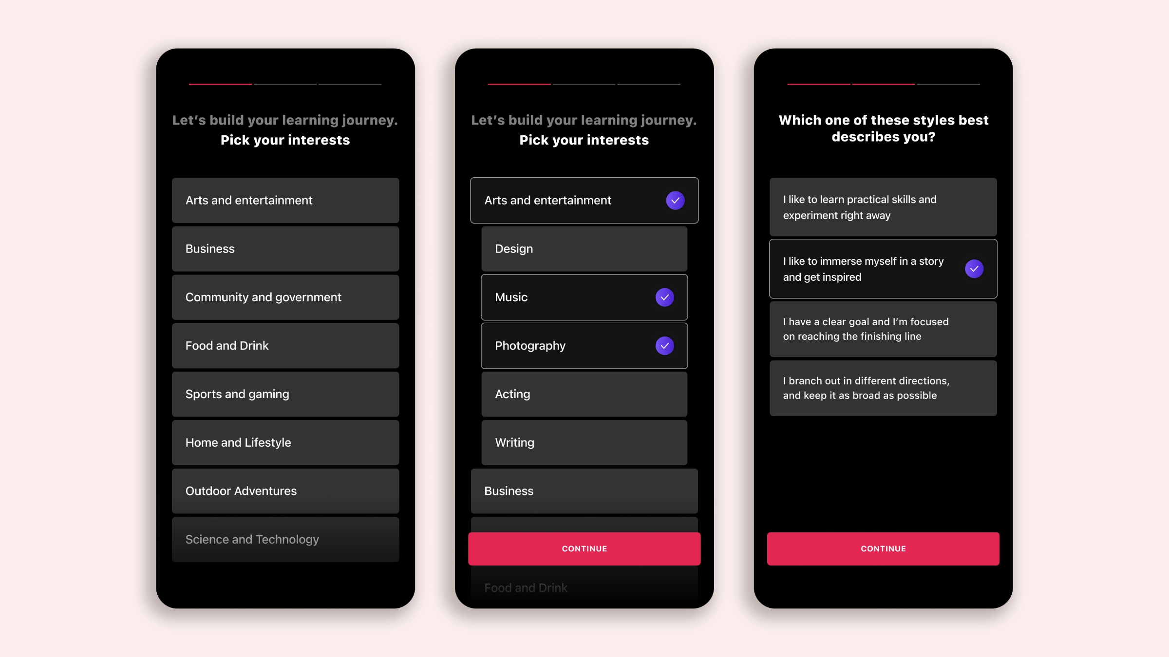
Mobile onboarding with a modular twist
Combining feature education with short-form video to increase first-day conversion
“Design is a blocker.” That’s what the Lead Mobile Engineer told me right after I joined MasterClass. My Design Manager explained that the Growth team was at capacity and we needed a solid vision for the apps’ onboarding, one that could unfold into a progression of experiments. Oh! They wanted that vision ready in two weeks. Thankfully I had solid growth and onboarding experience to draw from. My final concept brought together three elements: a compelling story to present what members got access to and convince users to subscribe; short videos to drop prospective members immediately into learning mode; and a modular approach to the narrative units composing the onboarding itself, allowing us to quickly test and measure conversion, keep the onboarding story cohesive, and have a chain of alternatives lined up for experimentation.