Projects tagged “Web”
Becoming a loyal Evernote note-taker
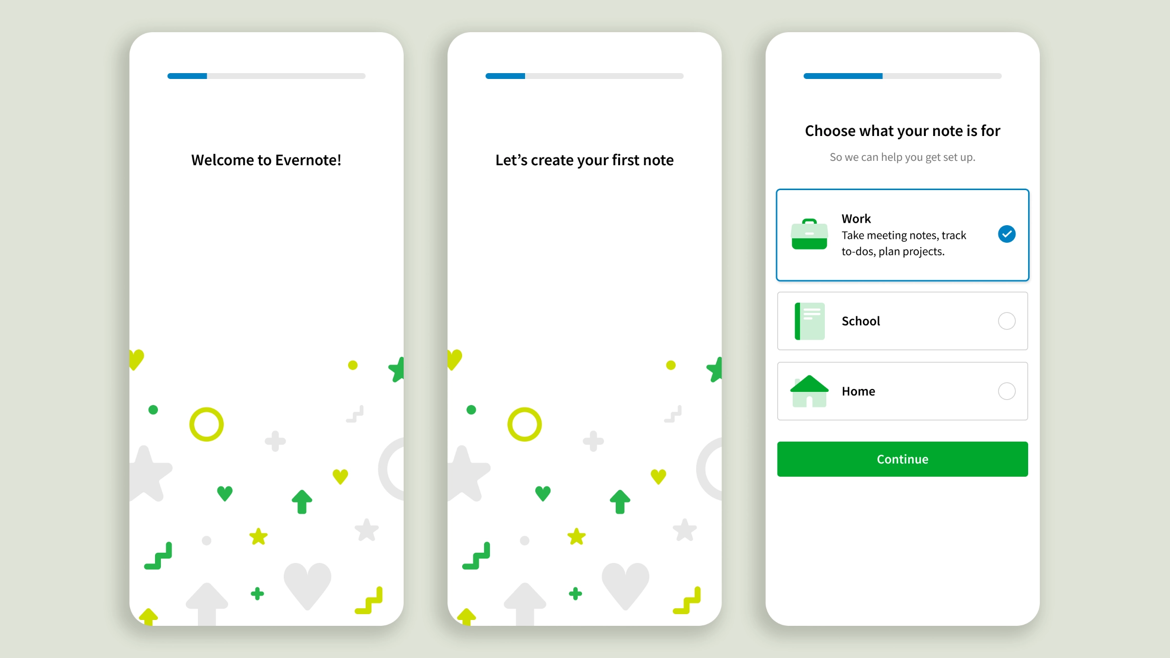
Onboarding personalization for a successful first-day activation
With increased competition from pre-installed note apps, Evernote took the activation challenge very seriously. At the time I joined the Growth Design team, experiments had corroborated the hypothesis of personalization as a lever for onboarding engagement. I contributed to the design of a Web client test, an effort leading to a 17% activation lift. After that, I took over the lead role, bringing personalization to the apps’ onboarding. The stakes on mobile were higher. It drove the majority of acquisition traffic but offered less real estate, the feature set was different, and app users’ attention is shorter, giving us just a handful of seconds to make a lasting impression. I deliberately softened the first part of the onboarding to guide users to create their first note without pressure. The experience is brief and drops users in front of features relevant to the use case they chose, rather than asking them to explore every knob of Evernote’s editor to figure out what it could do for them, as the old flow did.
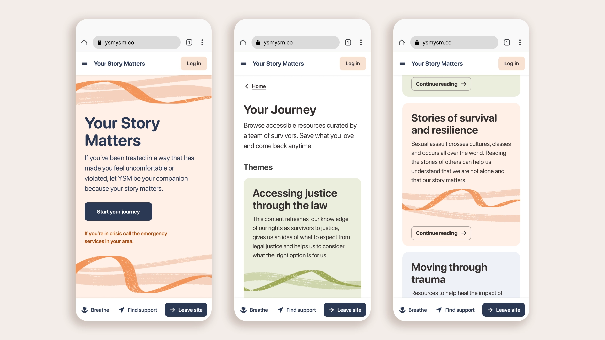
YSM, a web-app for domestic abuse survivors
Design volunteering project with UK non-profit Chayn
Design-for-good initiatives don’t always get the resources that commercial ideas do, but the impact they have on individuals and communities is real, and the passion that drives non-profits is exceptional. Founded by Hera Hussain, Chayn is one of these organizations, developing digital experiences for victims of domestic and gender-based violence. During the pandemic I signed up as a volunteer at Chayn and quickly got moved to design, as I was the only one with those skills. Over the course of a couple of years I learned a lot and passed on as much Figma knowledge as I could, to empower the team to design on their own. Now offline, Your Story Matters was one of the projects I contributed to, working on everything from information architecture to design system components. Because it doesn’t exist anymore, I took some time to clean up and rework my designs, to show you how I work independently outside a commercial setting.
How to win book lovers’ attention
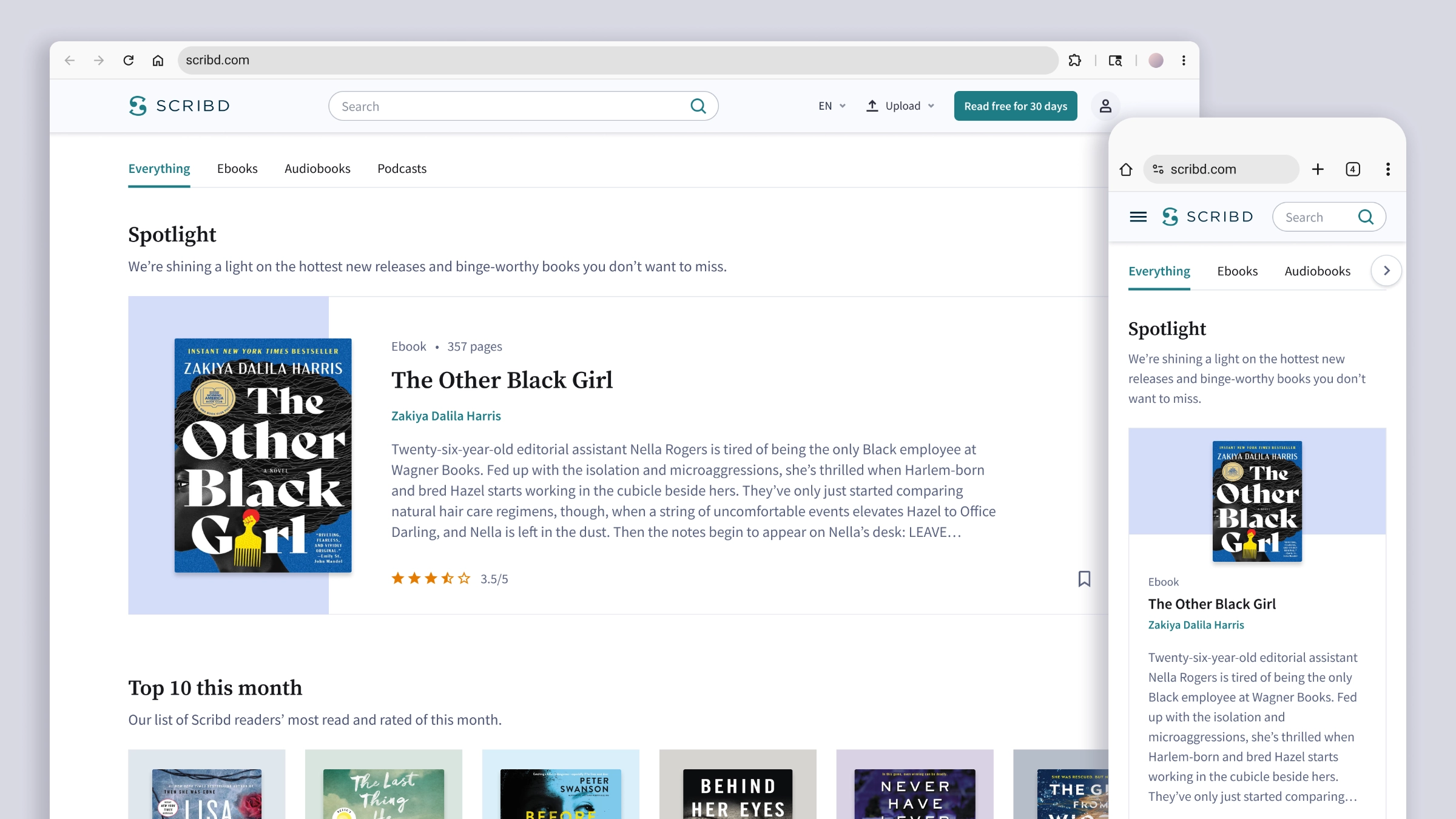
Rethinking Category Pages layout variations as a scalable system
When I was the lead designer of their SEO team, Scribd was still something like a hydra with two heads. Born as a place for uploading and sharing PDFs, it expanded into a book and audiobook subscription service, adding a Premium catalog of titles that became the core of the business model. But the overflowing volume of user-generated documents that made their SEO strategy so effective also meant Google didn’t recognize Scribd as a place for book readers. The SEO Product Manager set things in motion by redesigning key landing pages of the Premium book catalog. My first task was to redesign the Category Pages to capture readers’ attention and drive them to the Title Page, the highest-converting surface we had. It was a long and articulated project, and I laid out some ambitious goals: designing a modular layout structure that would allow for future experimentation; creating a content flow that would keep visitors engaged with the page as long as possible; and expanding our newly born design system with components that could benefit the site at large.
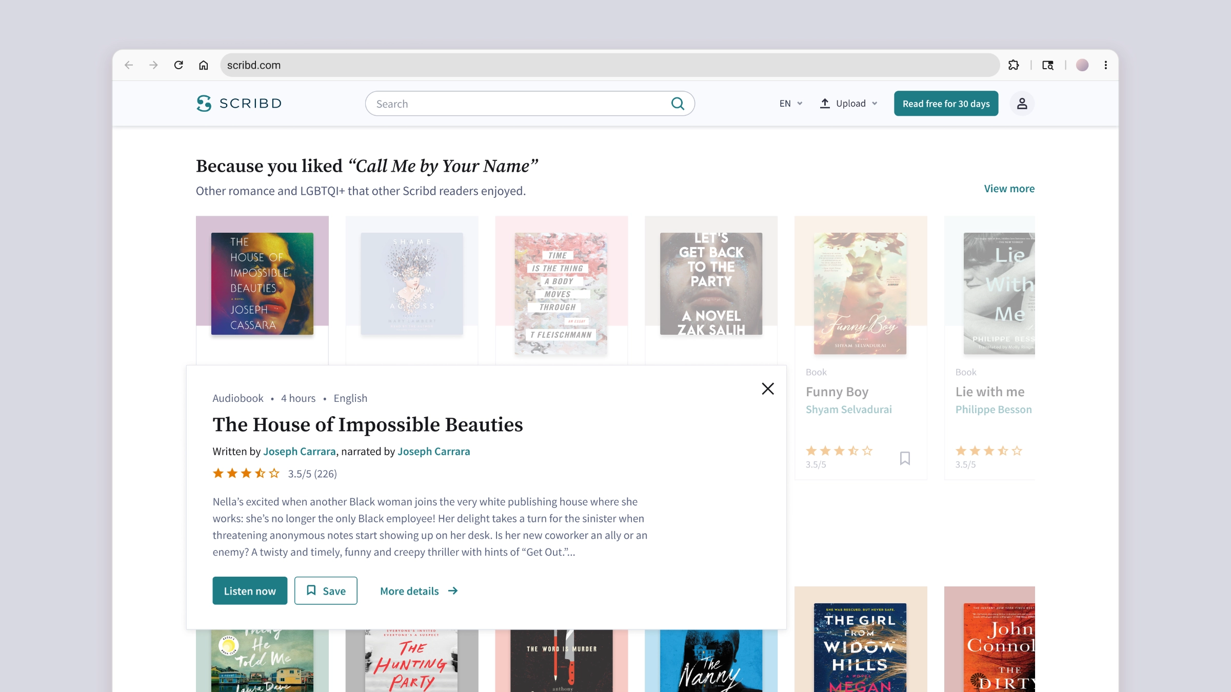
Design variants for a quick view component
Exploring interactions to turn an experiment into a core feature
This is one of those quick requests that can drop at any designer’s desk. A senior designer was moving into a manager position and asked me to explore visual design variants and interactions for a winning experiment that needed to be productized. The original design was a quick view panel for getting more information about a Title (book, audiobook, document, and so on), letting users better pick content without leaving the page they were on. We ended up choosing the safest route, building a component very close to the original designs. That said, I quite like some of my experiments, and I think they show how I approach interaction design and motion.
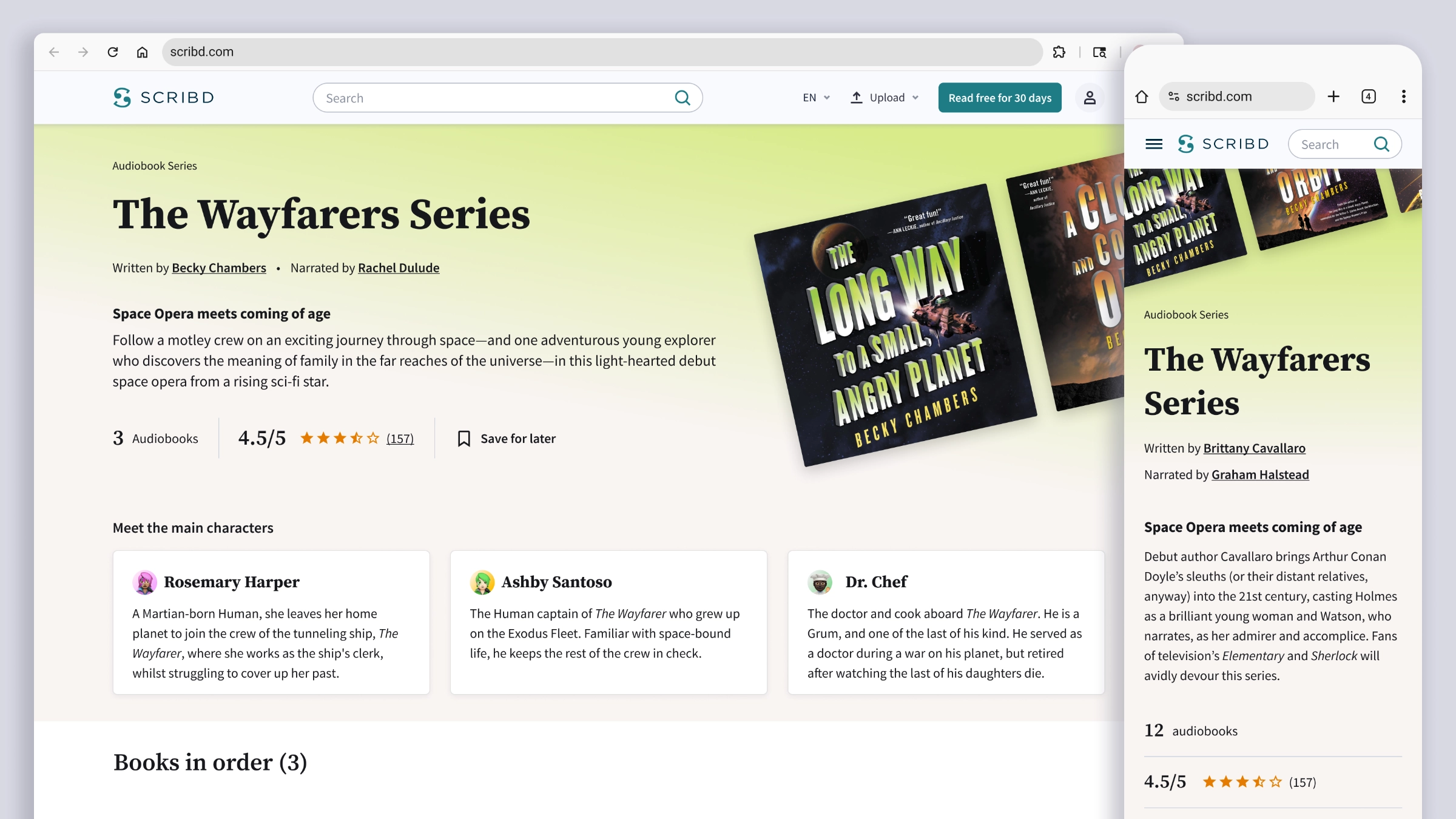
Crafting a compelling Book Series page
Expanding the acquisition surfaces as part of the SEO strategy
This was the last project I worked on at Scribd, and a very interesting one for a bookworm and series reader like me. Building on the design system components and visual choices from my previous project, the Category Pages redesign, I put together an experience aimed at being the best one could find on the web. Most series readers fall in love with characters and world-building, and look at the plot as a way to get deeper into both. But Wikipedia tends to be their only friend, often the only reliable place to track all the titles in a series and their correct order. My designs for Scribd’s Series Page had the potential to be just as informative and exhaustive, while putting forward an offer hard to resist: subscribe, and you can read all of these titles in one place.
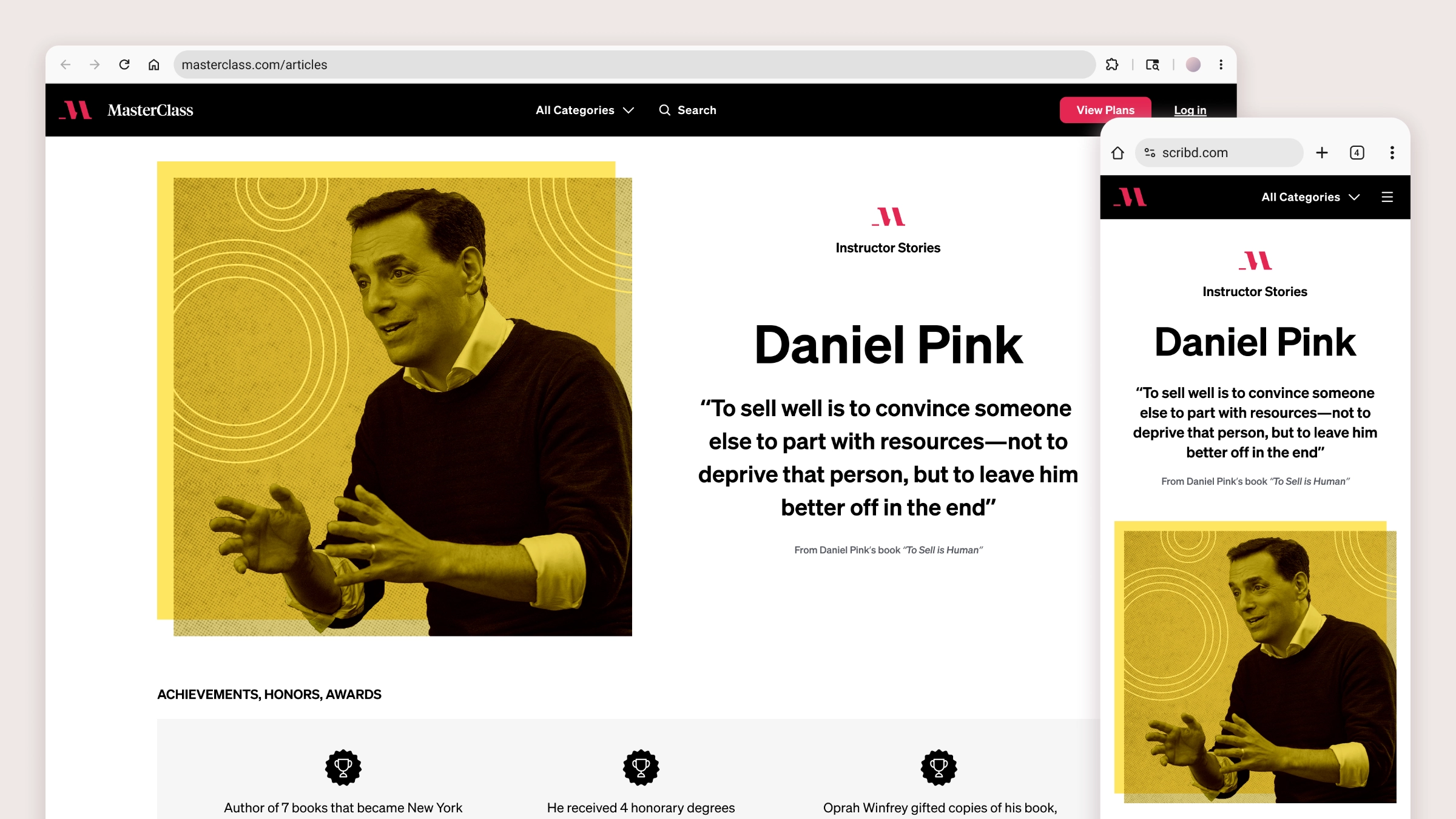
Using immersive reading for SEO acquisition
Editorial design for MasterClass’ Instructor Pages and Articles
At the time I joined the team, a new Product Manager was taking the lead on rebuilding MasterClass’ SEO strategy, moving away from the simplistic approach of publishing as many Articles as possible. Loosely connected to the platform’s offering, all Articles shared one template with a brief text randomly interrupted by promos and CTAs trying to divert readers’ attention toward the subscription. The Product Manager wanted stronger alignment with both the brand and the audience. He kicked things off with Instructor Pages, a new format of SEO articles telling the compelling stories of MasterClass’ popular instructors, with the goal of ranking high on SERPs and drawing higher-intent traffic. My task was to design a new template where immersive reading would organically lead into conversion, with the possibility of reusing and adapting the new layout and components to retrofit the older Articles.