Projects tagged “Design-system”
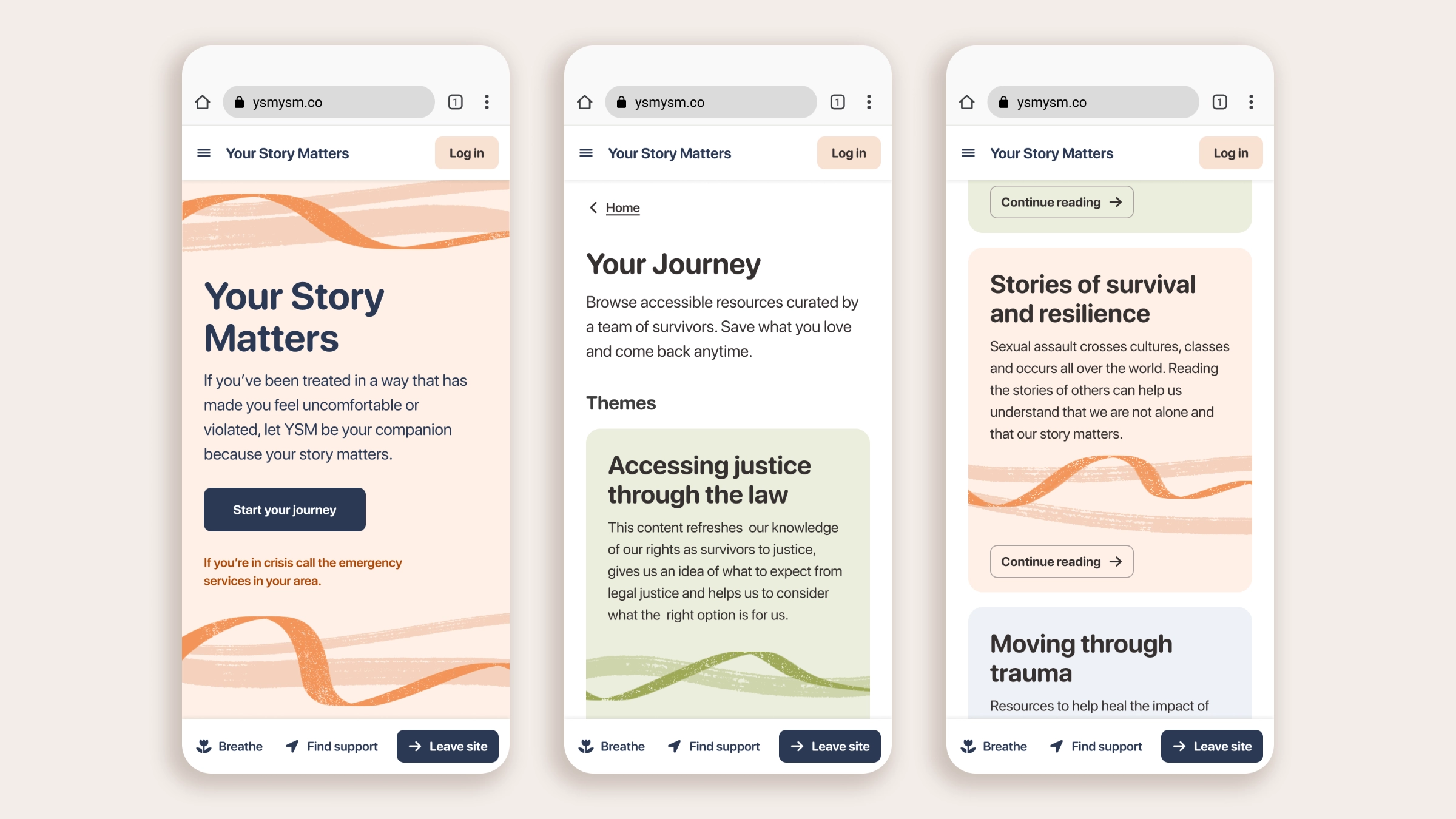
YSM, a web-app for domestic abuse survivors
Design volunteering project with UK non-profit Chayn
Design-for-good initiatives don’t always get the resources that commercial ideas do, but the impact they have on individuals and communities is real, and the passion that drives non-profits is exceptional. Founded by Hera Hussain, Chayn is one of these organizations, developing digital experiences for victims of domestic and gender-based violence. During the pandemic I signed up as a volunteer at Chayn and quickly got moved to design, as I was the only one with those skills. Over the course of a couple of years I learned a lot and passed on as much Figma knowledge as I could, to empower the team to design on their own. Now offline, Your Story Matters was one of the projects I contributed to, working on everything from information architecture to design system components. Because it doesn’t exist anymore, I took some time to clean up and rework my designs, to show you how I work independently outside a commercial setting.
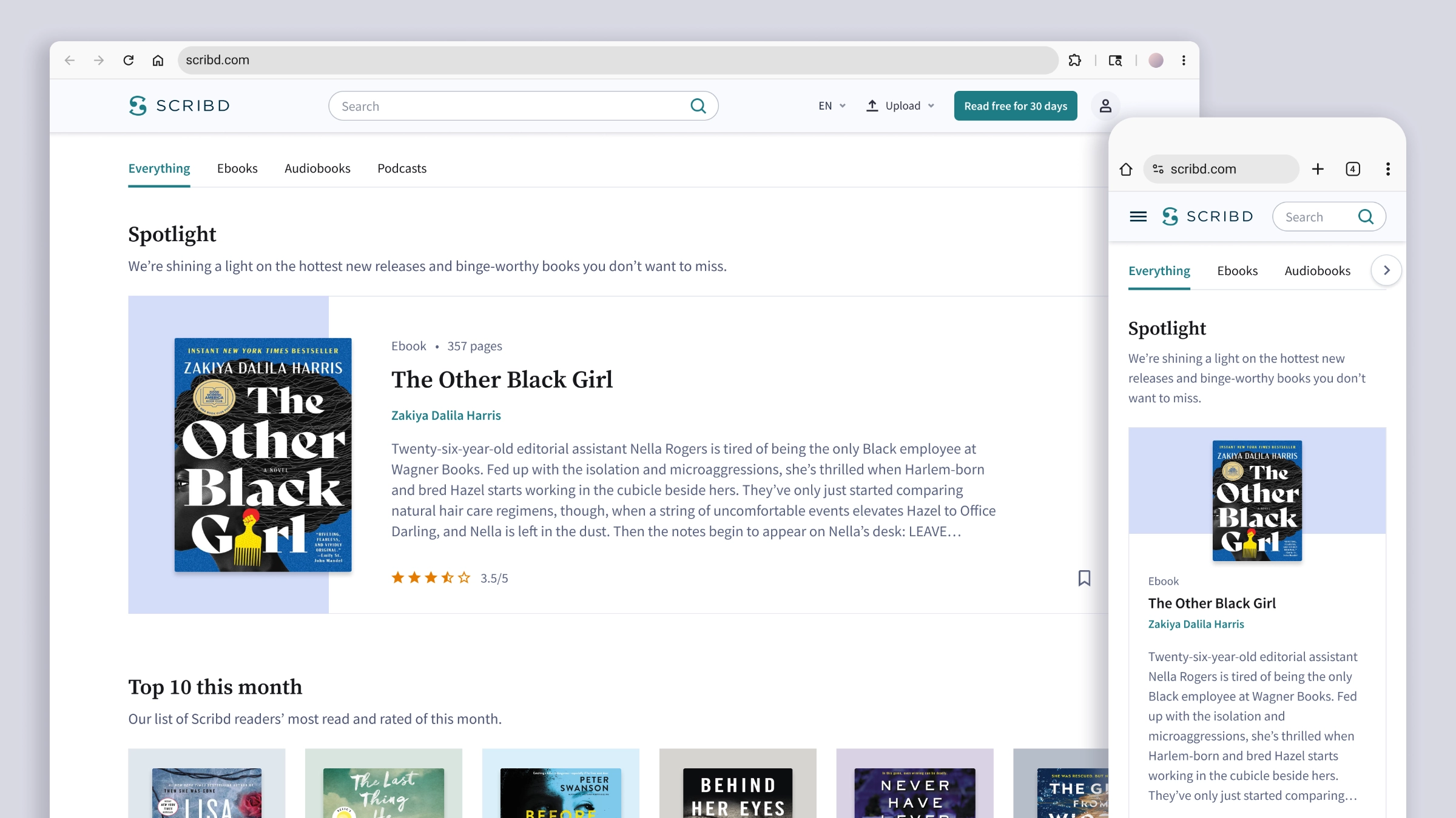
How to win book lovers’ attention
Rethinking Category Pages layout variations as a scalable system
When I was the lead designer of their SEO team, Scribd was still something like a hydra with two heads. Born as a place for uploading and sharing PDFs, it expanded into a book and audiobook subscription service, adding a Premium catalog of titles that became the core of the business model. But the overflowing volume of user-generated documents that made their SEO strategy so effective also meant Google didn’t recognize Scribd as a place for book readers. The SEO Product Manager set things in motion by redesigning key landing pages of the Premium book catalog. My first task was to redesign the Category Pages to capture readers’ attention and drive them to the Title Page, the highest-converting surface we had. It was a long and articulated project, and I laid out some ambitious goals: designing a modular layout structure that would allow for future experimentation; creating a content flow that would keep visitors engaged with the page as long as possible; and expanding our newly born design system with components that could benefit the site at large.
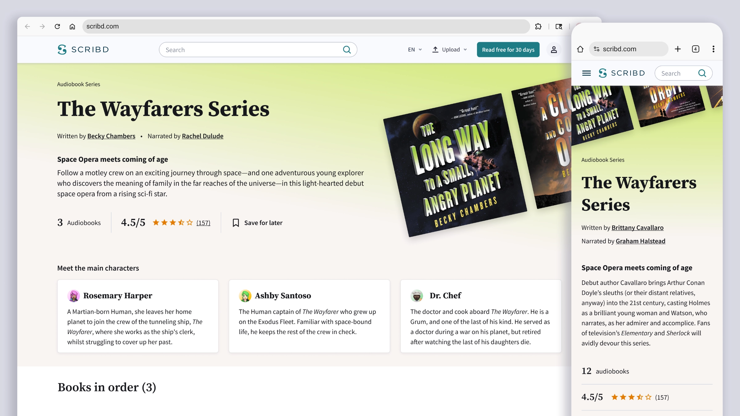
Crafting a compelling Book Series page
Expanding the acquisition surfaces as part of the SEO strategy
This was the last project I worked on at Scribd, and a very interesting one for a bookworm and series reader like me. Building on the design system components and visual choices from my previous project, the Category Pages redesign, I put together an experience aimed at being the best one could find on the web. Most series readers fall in love with characters and world-building, and look at the plot as a way to get deeper into both. But Wikipedia tends to be their only friend, often the only reliable place to track all the titles in a series and their correct order. My designs for Scribd’s Series Page had the potential to be just as informative and exhaustive, while putting forward an offer hard to resist: subscribe, and you can read all of these titles in one place.
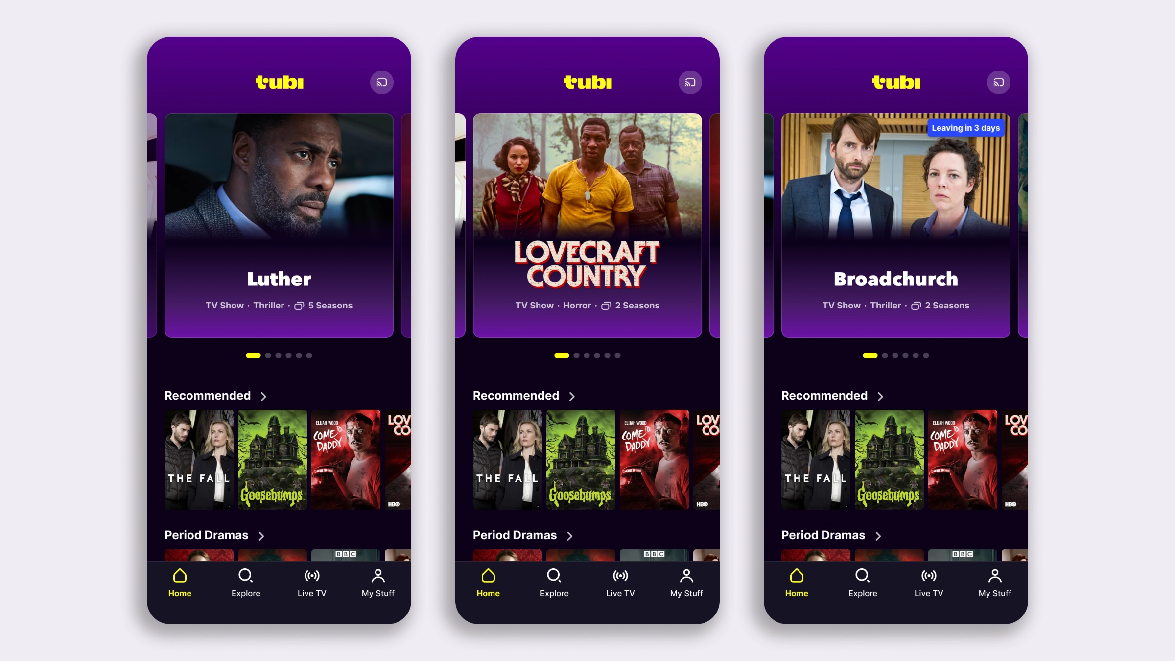
The less you browse, the more you watch
Mobile app redesign to improve content discovery and watch time
The iOS Lead Engineer at Tubi reached out to me for a self-initiated project: she had a strong conviction that the mobile experience needed work, and a green light from Product to go ahead and come up with proposals. Together we also found, and claimed, a parked ticket for increasing the visibility and discoverability of TV Series. We brought the two goals together into one project, giving the iOS and Android teams an opportunity to better sync on experiments and feature releases. My approach to this revamp is one I like and cheer for whenever I can: look at the big picture holistically, but break the design down into individual tests to build a roadmap, rather than shipping one sweeping change that’s difficult to measure. The challenge, and what I find most valuable about this method, is making sure the long-term vision holds regardless of the outcome of any individual experiment it’s made of.