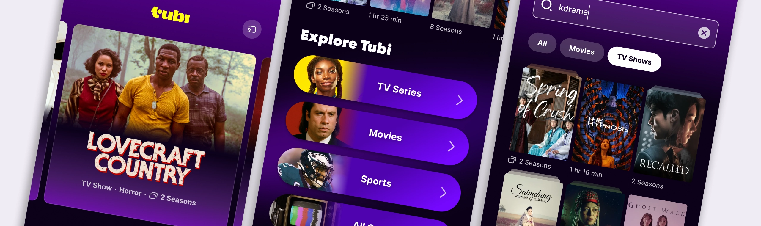
The less you browse, the more you watch
At a glance
- Role
- Senior Product Designer, Content & Discovery (lead and sole designer)
- Team
- iOS and Android lead engineers, Senior UX Researcher, one PM
- Timeframe
- 2023, 1 month
- Platforms
- iOS, Android
- Goal
- Improve discoverability of content types for new users in the mobile apps
- Skills
- Mobile design, design systems, UI and visual design, A/B experimentation
The context
How the project started
Sara, the iOS manager and lead engineer, reached out to suggest we work together to improve Tubi’s iOS and Android user experience, which hadn’t been updated in a while. While most teams were focused on the OTT platforms, we noticed a steady flow of app installs and new users from the app stores. Design had evidence that users often try the app before deciding to install it on their TV, and the Product team recognized the potential to boost new-user acquisition.
Sara and I found an old design request about making TV Series easier to find in the apps, so we decided to include it in our project. The Android team wanted to use this opportunity to work alongside the iOS team and run experiments together, rather than waiting for the other team to launch before catching up. Since the Product team was busy, they told Sara to go ahead without a Product Manager for now, and to check in once we had a proposal ready.
This was the perfect chance to explore a redesign that could span several screens, maintain a clear long-term vision, and break ideas into experiments so we could see the impact of each change and adjust direction as needed.
The problem
Breaking the “big wall of content”
We’ve all been there: sitting in front of the TV or opening a streaming app, scrolling through endless rows of content, and struggling to pick something to watch. Sometimes, nothing feels worth our time, so we give up, go to bed, or switch to social media. With so much content, the paradox of choice can leave us feeling bored and overwhelmed.
The longer someone spends searching, the more likely they are to get frustrated and stop engaging. Tubi’s catalog has over 50,000 titles, so there’s something for everyone. But it’s easy to get lost while searching and never find what you want.
Our user research into how people discover content on Tubi and other platforms revealed something less intuitive yet interesting. Often, users don’t have a specific title in mind when opening a TV app, but they usually know whether they’re in the mood for a movie or TV show, what vibe they’re looking for, and which genres are total deal breakers. Their choices also depend on whether they’re watching alone or with others.
With this in mind, our app could help people find the right match more easily, instead of letting them get lost among thousands of unrelated titles.
The analysis
Using user journeys to identify design opportunities
To assess how effective and enjoyable Tubi’s app discovery was, I set out to examine the experience from the user’s perspective, taking detailed notes along the way about the design choices and how they fulfilled the original promise. To do this, I chose 4 hypothetical paths:
- “I am ready to start a new series; let’s see what Tubi has.”
- “I am ready to start a new Series; let’s search Tubi.”
- “I want to watch a K-Drama TV Show; let’s see what Tubi has.”
- “I just finished a great series on Tubi; I want to watch something similar.”
I confronted every design choice I found in the app and asked myself: “How is this helping me in my journey? Is it making it easier to find something I would be excited to watch, or not?” This type of exercise could create some tension, especially if a team has a habit of avoiding “negativity”. I believe friction points are just opportunities waiting to be found, and that’s the angle I chose to present this teardown study to the other designers, highlighting what we could improve on.
I chose the areas to focus on based on impact. These included: upgrading the hero section on the home screen, instrumenting carousel rows and grid containers to more clearly distinguish content types, improving search result precision, and updating the Title Details page to better fit TV Series.
#1 Elevating TV Series on Home
Turning the Hero card into a true star
The Hero carousel on the Home screen was the highest-traffic surface, and to distinguish content types and ensure each had the appropriate relevance, it needed to be redesigned. The keys were layout flexibility, metadata clarity, and the possibility to show video previews, which tested positively on TV for watch engagement.
Led by the principle that video previews needed to be moved to center stage, this turned into an exercise in fine-tuning variants of a single component, based on a short list of requirements I gave myself:
- Allow video previews/trailers to be shown in their original aspect ratio
- Support the following video preview controls: audio on/off, pause/play, captions
- Show essential Metadata: content type, top genre, duration
- Have room for badges: Live, Coming soom, Leaving soon, Tubi Originals
- Allow titles of varying lengths (up to 2 lines) and custom title art
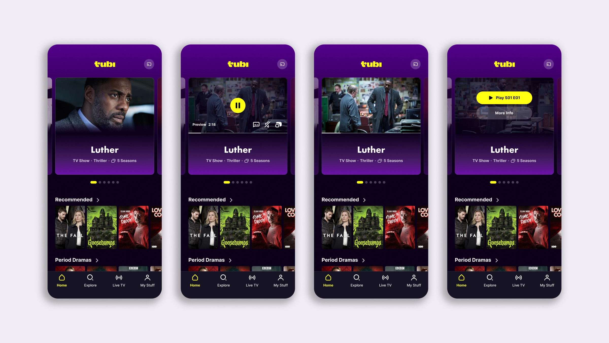
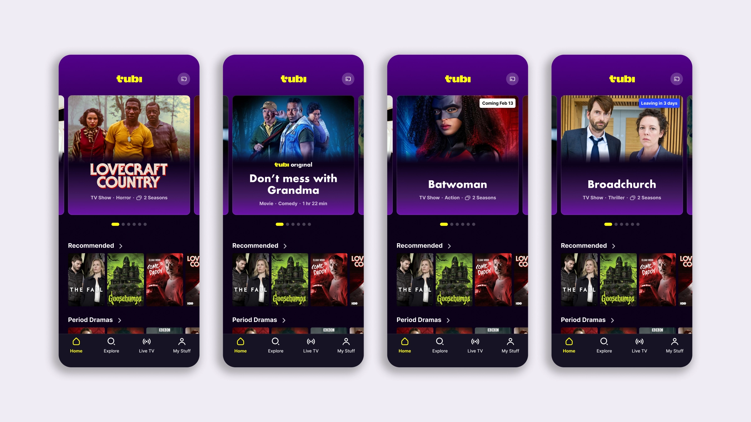
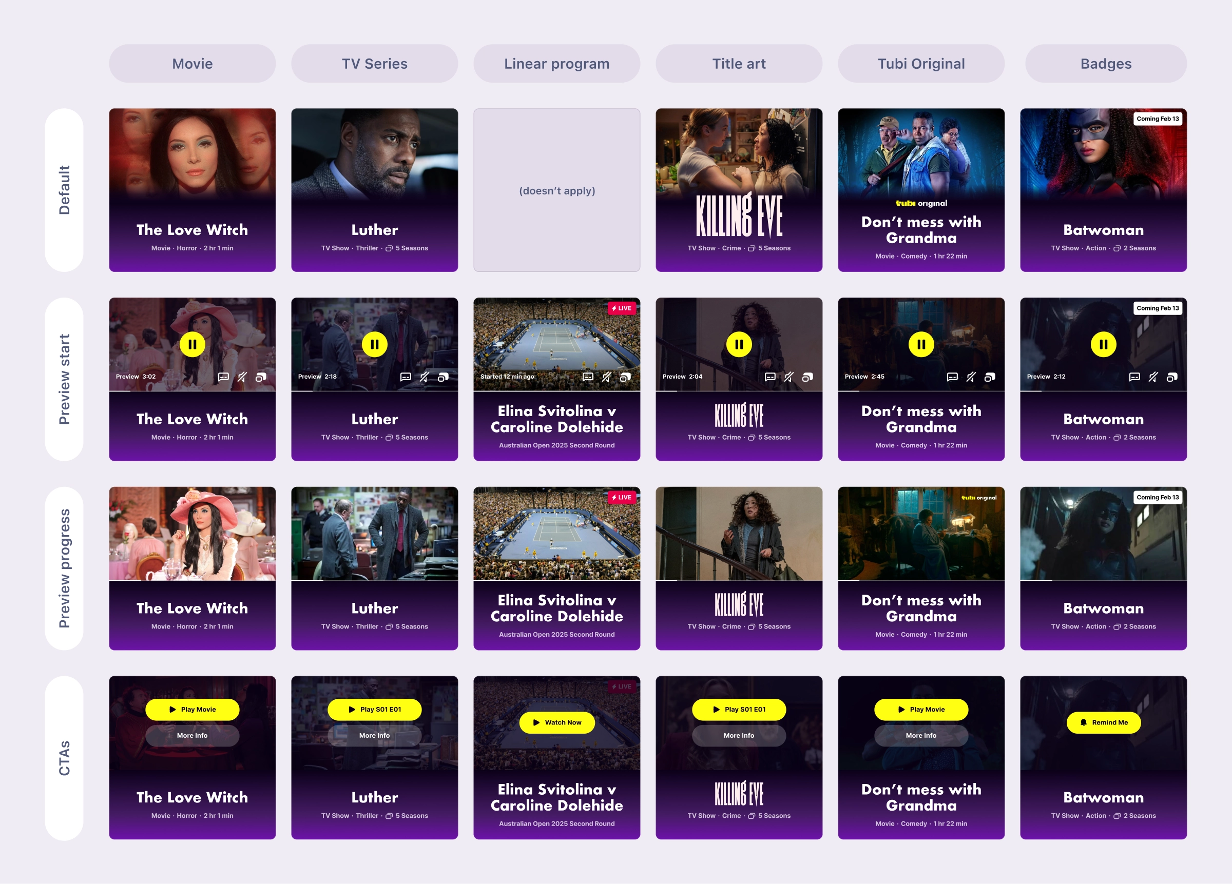
My suggestion for testing was to decouple the two variables: the design of the card itself from the video previews. The card addressed the functional needs we had for growing our catalog, and it only needed to perform better or be neutral compared to the current design. For the video previews, we instead wanted to quantify their impact on conversion precisely (the start of a watch activity).
#2 Differentiation in containers
Designing a more efficient Home discovery
First: a pattern for breaking futile scrolling
At the top of the Home screen were content-type pills for tabbing into containers for Movies or TV Series only. However, the pattern was misleading (pills are for filtering a current view), and most users would never interact with them. Which is common sense: it’s simply unlikely that, on a (new) streaming platform, the first instinct is to use filters. Most users would scroll, even more so since we’re conditioned by repeated behavior on social content feeds; yet on a content screen, the more a new user scrolls, the less likely they are to engage.
I designed a new element, visually larger and distinctive, noticeable among the title posters, to break the scroll and trigger curiosity, and with it a tap and possibly a new and more successful journey. I moved it down a couple of scrolls from the top of the screen.
One size doesn’t necessarily fit all, so I had the idea for a dynamic version of this pattern, directed to our core users with a weekly Tubi habit and a solid watch history. By bringing personalization, or even customization, we would create a recurring shortcut to their favorite content. If validated by testing, this pattern could work in other places, such as the Explore tab. The right amount of redundancy makes the interface predictable enough to feel familiar.
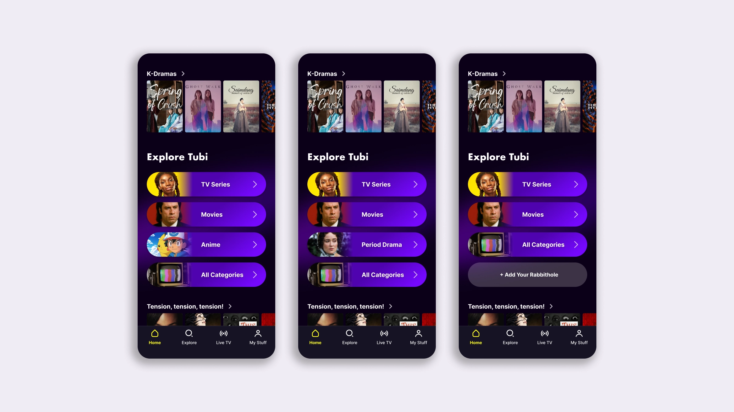
What we wanted to measure was overall engagement with the buttons, engagement for each button, and the impact on user conversion (watch activity start) and/or the probability of the user returning for a subsequent session. I was also interested in seeing how placement relative to the top had an impact on engagement with this element, testing 2/3 alternatives.
Creating a new visual language for TV Series thumbnails
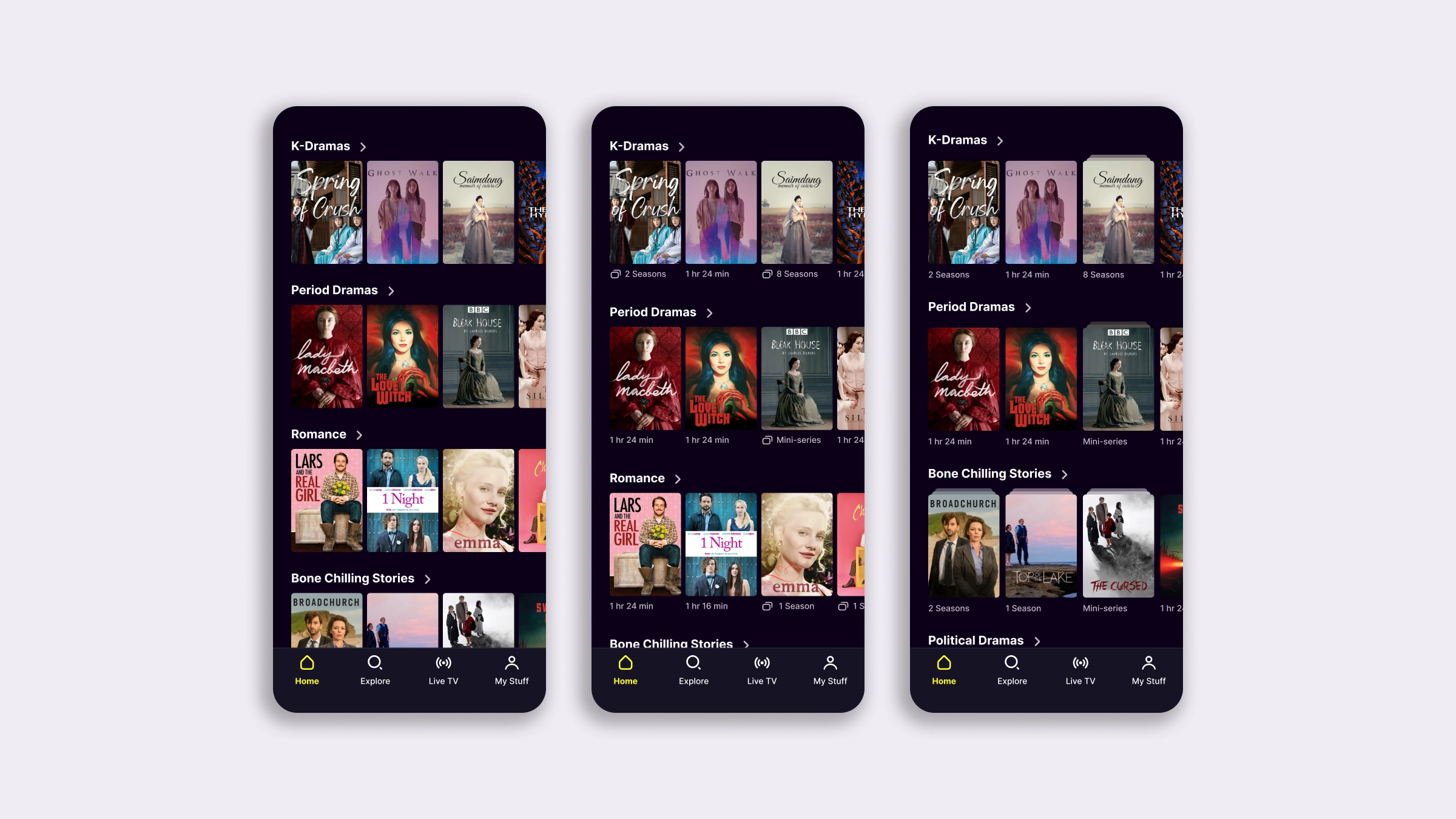
In streaming, movies and TV series are equally represented by a single poster, or thumbnail. This means that in a content carousel row, a 90-minute movie looks the same as a 6-season, 72-episode series, and a long multi-season series looks like a 3-episode mini-series. There’s no correlation between the UI cue and the content's depth or length; it’s always just one poster. And if the user doesn’t recognize the title, as happens on Tubi, they can’t tell which is which.
I proposed two ways to solve this issue with a UI change:
- Adding a line of metadata below the posters, showing duration
- Combining the metadata with a special visual treatment for the TV series poster
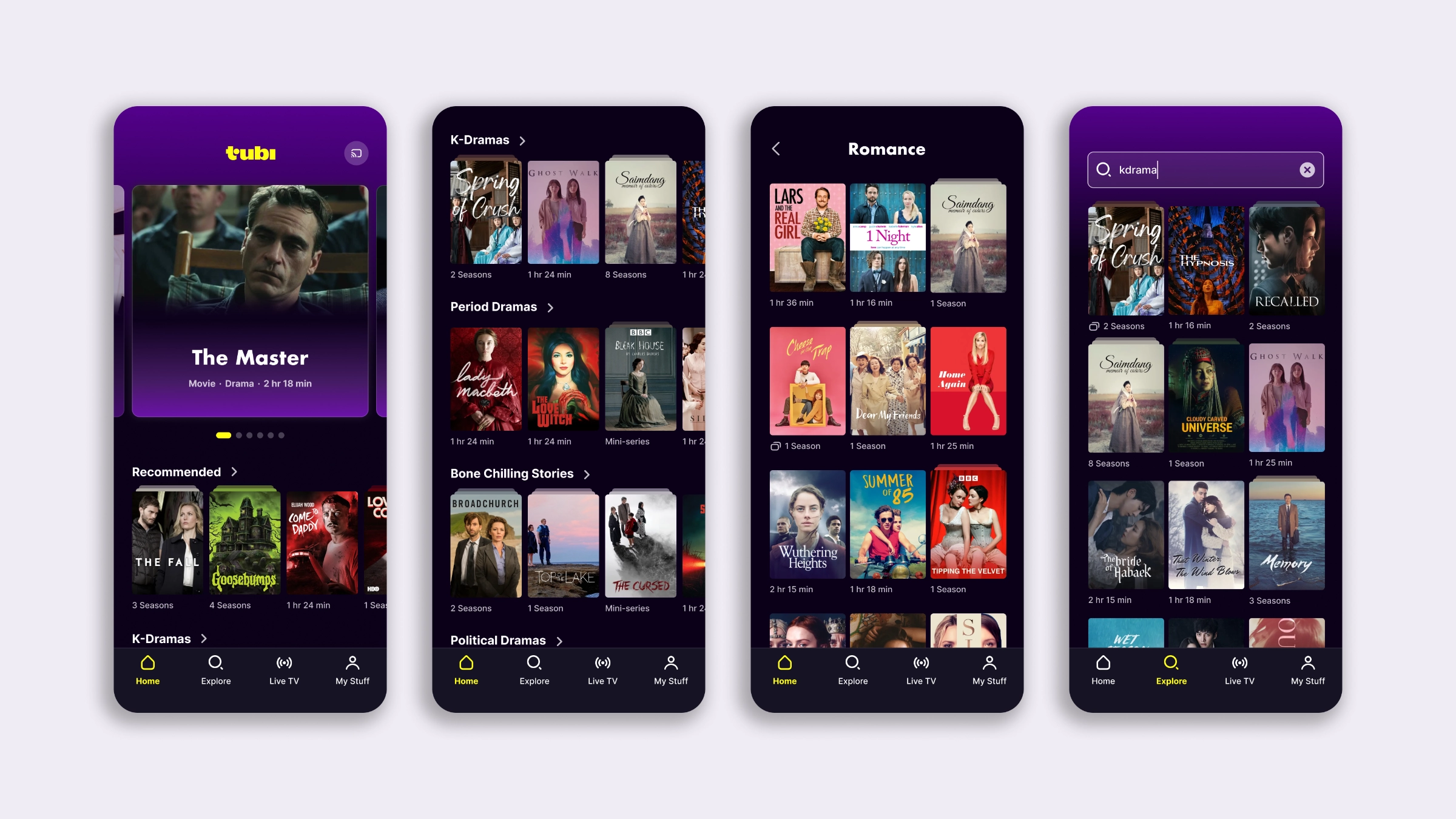
Introducing filters on grid containers
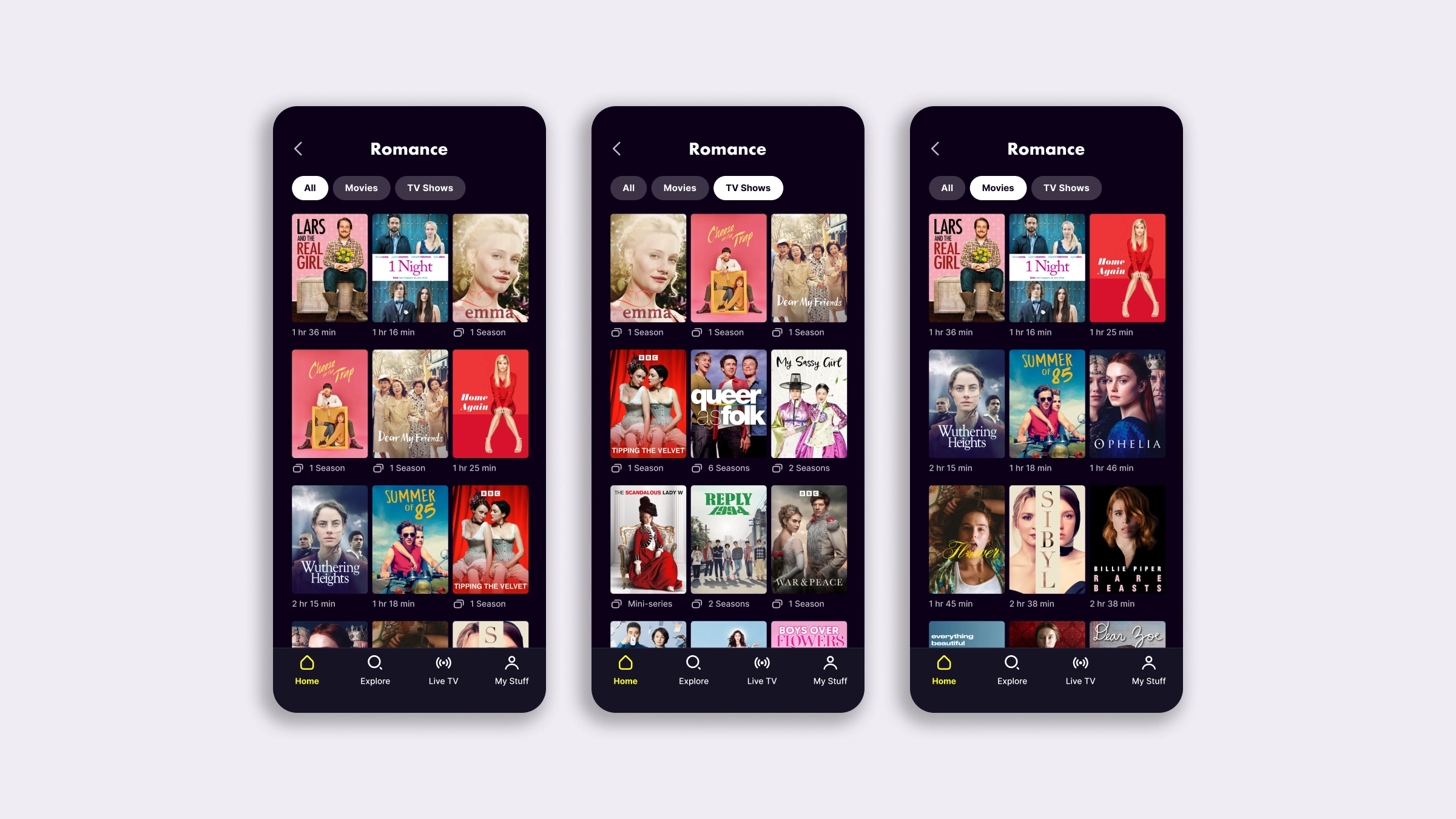
If we consider a user navigating deeper into a carousel row, or a genre from the Explore tab, or, again, a Collection, we see that filters are the easiest (and cheapest!) way to separate content types. Let’s remember that most users land with a preference in mind: the algorithm can guess them, but filters are immediate and effective, and they give users full control.
As shown in the mockups for the grid containers, the TV series metadata/thumb treatment and the filters are neither mutually exclusive nor interdependent. No matter what testing order is chosen, or which direction the results sway, the final UI would still be cohesive.
#3 Improving search results accuracy
Enhancing search results relevance
Keeping in mind the principles of modularity and sustainability, I proposed testing the same content-type filters used on the container grid screens on the search result screen. The engineering effort would have been low, and users would have had one more way to search faster and more precisely. Going a step further, I built a prototype to demonstrate how filters can respond to the user’s input when typing keyword-related content, such as “tv” or “series”. If a match is found, we automatically apply the filter for the user, which removes an extra tap.
The experiment for this surface would have measured engagement with the filters to determine whether using the filters is correlated with a greater likelihood of engaging in a watch activity.
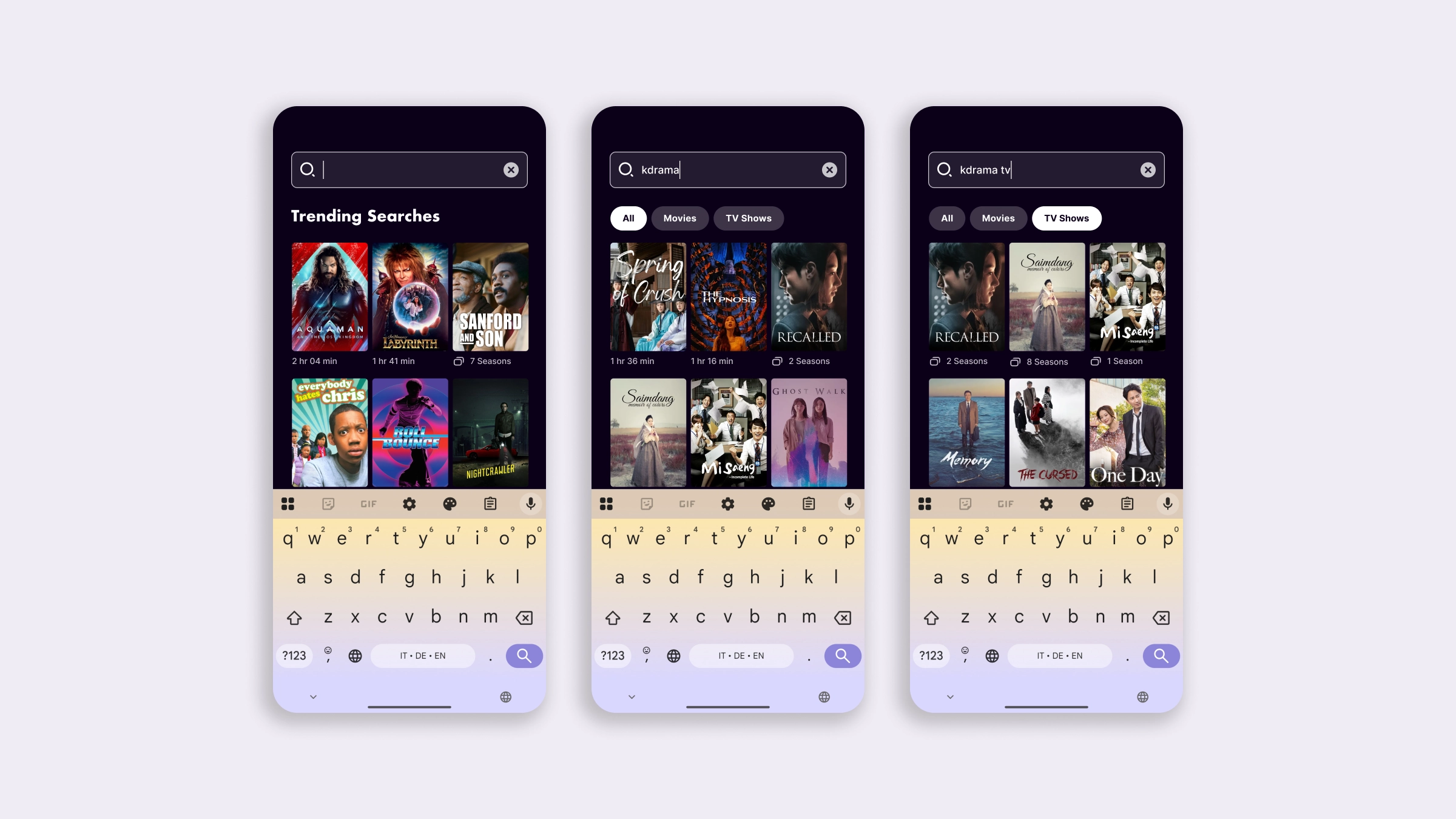
My approach to this project was to design changes for specific patterns or components that could be applied across screens and sections of the app. This method means I address critical points in the discovery journey and also achieve an app-wide redesign through a modular series of experiments.
#4 Increasing template flexibility
Rebuilding Title Details for fast, effective discovery
Designing a flexible layout optimized for skimming
The Title Details screen was the kind of screen users would scroll and scan, latching onto UI elements that piqued their interest or curiosity, but the page I found and reviewed subverted all the rules of good visual communication and information hierarchy. Elements were not arranged in a logical order for decision-making and were often too small and visually hard to read. Action buttons weren’t laid out following a primary-to-secondary approach; the screen was designed to accommodate the information available in the database, not to guide the user.
My goal was to create a layout that users could scan easily, a functional page for deciding whether to watch or move on, and, if so, a way to jump to another title.
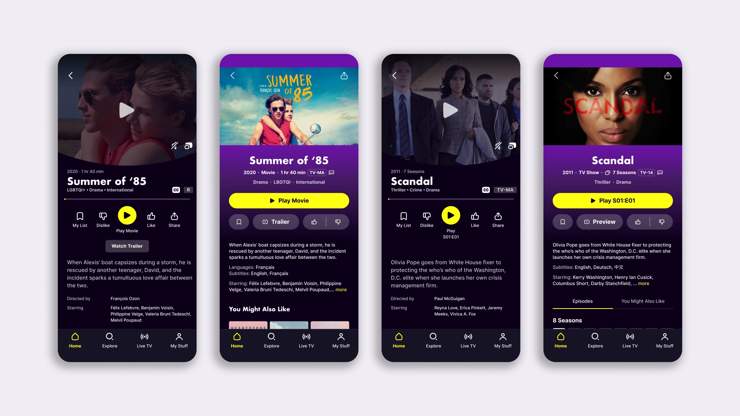
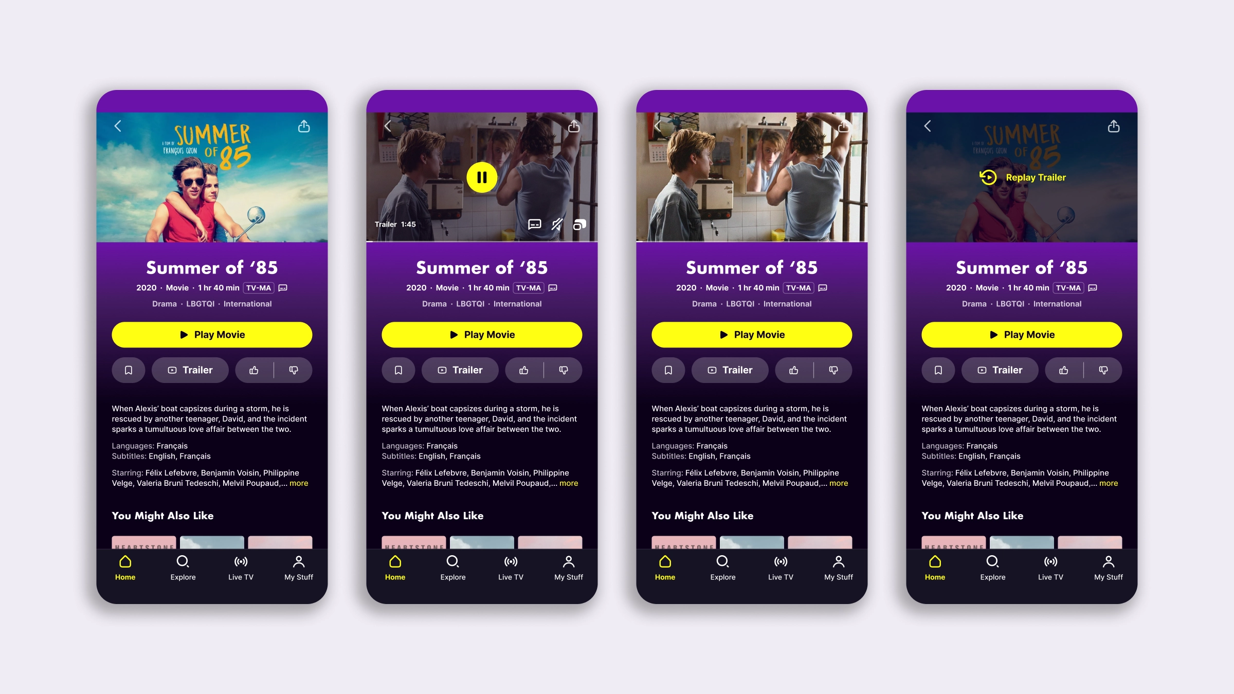
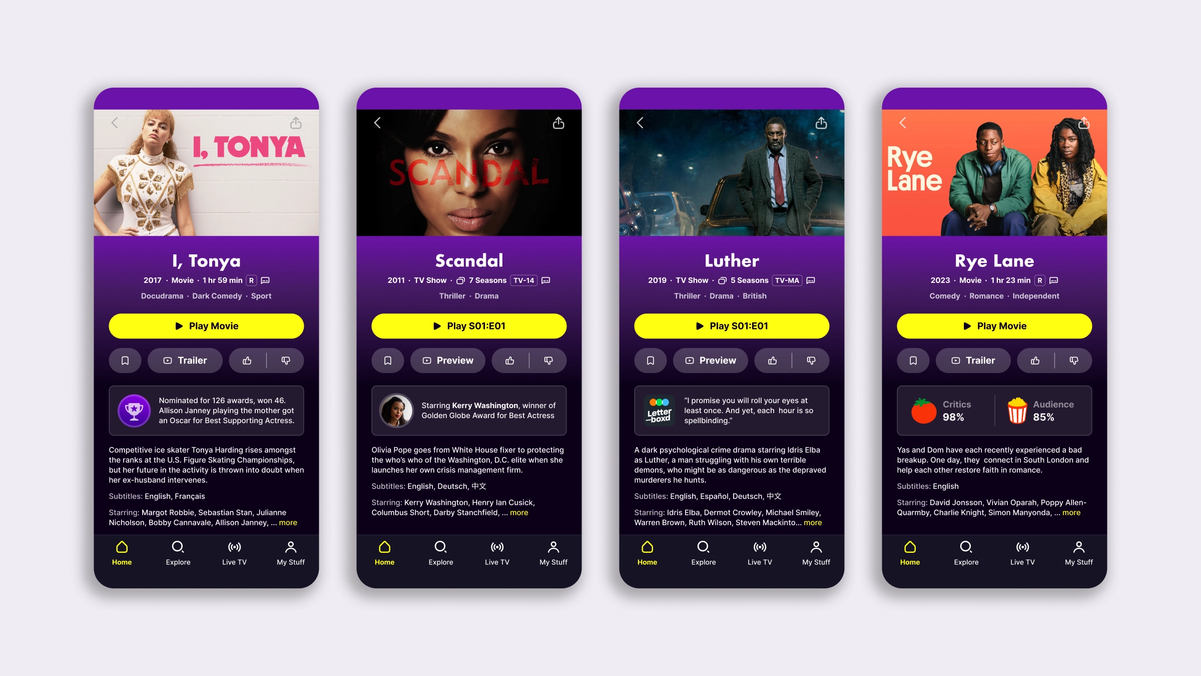
- For the top part of the screen, I used the same principles and elements I designed for the Hero card, with minor adjustments to the video previews CTA. The metadata treatment was the same, just expanded to allocate for more details.
- Actions were split and reordered into primary and secondary categories, and buttons followed the same visual logic, with clear, visible hit areas.
- Details after the blurb were collapsed with a toggle, making it possible to get a better peek at the content below the fold, especially for traveling to related titles.
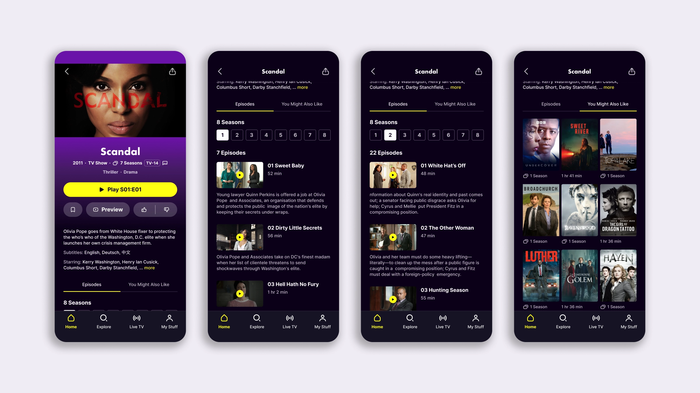
- For TV Series, I swapped the Seasons dropdown button for numbered buttons so users could immediately see how long a series was and fiddle with the interface less.
- Again on TV Series, I tabbed the episodes list with the “You Might Also Like” recommendations; check out how I combined that grid with the metadata treatment.
Transforming Tubi into the best guide on Tubi’s content
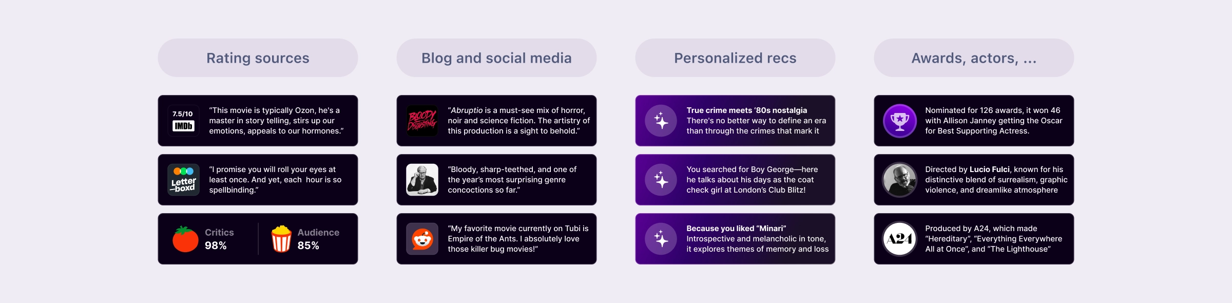
I mentioned that this screen was not taking a stance: it just looked like any other screen from a free-with-ads streaming app, and because we serve content through the same providers, the blurbs and genres were also the same. Reflecting on how new Tubi users didn’t recognize titles and generally expressed low trust on their first visit, I came up with an idea to highlight key quick facts about each title to simplify their journey.
Outside of Tubi, there were many ways to get a read on a title’s quality or vibe; it was just a matter of bringing it into the app and borrowing some of the authority it carried.
I designed a highlight as a small, visually catchy, easy-to-parse element that sits right above the blurb to minimize scrolling. Tubi was among the first tech companies to secure a contract with OpenAI, so using their technology would have made it possible to build an experiment for a subset of our titles with relatively low effort.
#5 Bonus idea
The quickview drawer
What if a user doesn’t have to navigate to the Title Details screen? What if they can watch a preview or see more details from anywhere in the app with just one tap? Based on my previous experience with content platforms, where quick-view panels won experiments by a large margin, I proposed testing opening the Title Details screen from any row or grid container in a drawer. To test this mechanism, we didn’t need to change the screen layout, since it could have run independently of the changes above.
Conclusions
The importance of getting a buy-in
I didn’t present this as a redesign of the app, but as a roadmap of experiments that would lead to a general UX uplift. It’s possible to design in a modular way, test piece by piece, and create a long-term, cohesive experience. Each solution is an experiment, but the real merit lies in the possibility of reconciling these elements harmoniously. When an experiment roadmap of disconnected tweaks leads to a Frankenstein page, the overall experience will suffer, reversing gains.
While I started speccing the first three solutions for the experiments, this project ultimately stalled. This was partly due to the initial setup, where Product wasn’t involved from the start, which led to a lack of motivation or buy-in for the goals. The iOS Lead engineers also left the company, and without her commitment, the whole initiative lost steam.
What’s interesting is that since I’ve done these explorations, Tubi has revamped their Hero card on the Home screen; the new version looks much more like the card I designed. I don’t assume they’ve based the redesign on my Figma explorations, which makes it even better and feels like validation for my idea: it was the logical solution a good designer would adopt for that section.
Back to all projects