Projects tagged “Mobile”
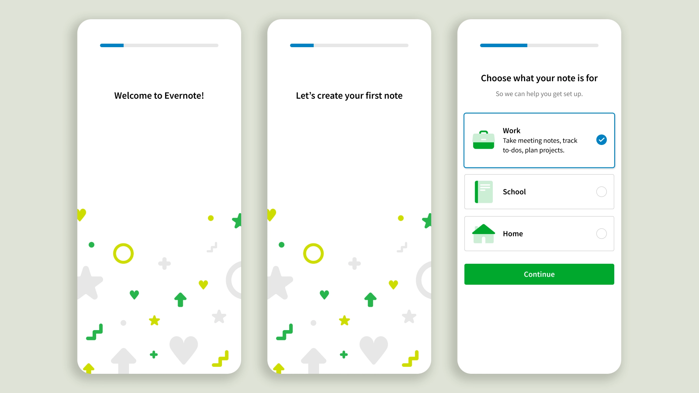
Becoming a loyal Evernote note-taker
Onboarding personalization for a successful first-day activation
With increased competition from pre-installed note apps, Evernote took the activation challenge very seriously. At the time I joined the Growth Design team, experiments had corroborated the hypothesis of personalization as a lever for onboarding engagement. I contributed to the design of a Web client test, an effort leading to a 17% activation lift. After that, I took over the lead role, bringing personalization to the apps’ onboarding. The stakes on mobile were higher. It drove the majority of acquisition traffic but offered less real estate, the feature set was different, and app users’ attention is shorter, giving us just a handful of seconds to make a lasting impression. I deliberately softened the first part of the onboarding to guide users to create their first note without pressure. The experience is brief and drops users in front of features relevant to the use case they chose, rather than asking them to explore every knob of Evernote’s editor to figure out what it could do for them, as the old flow did.
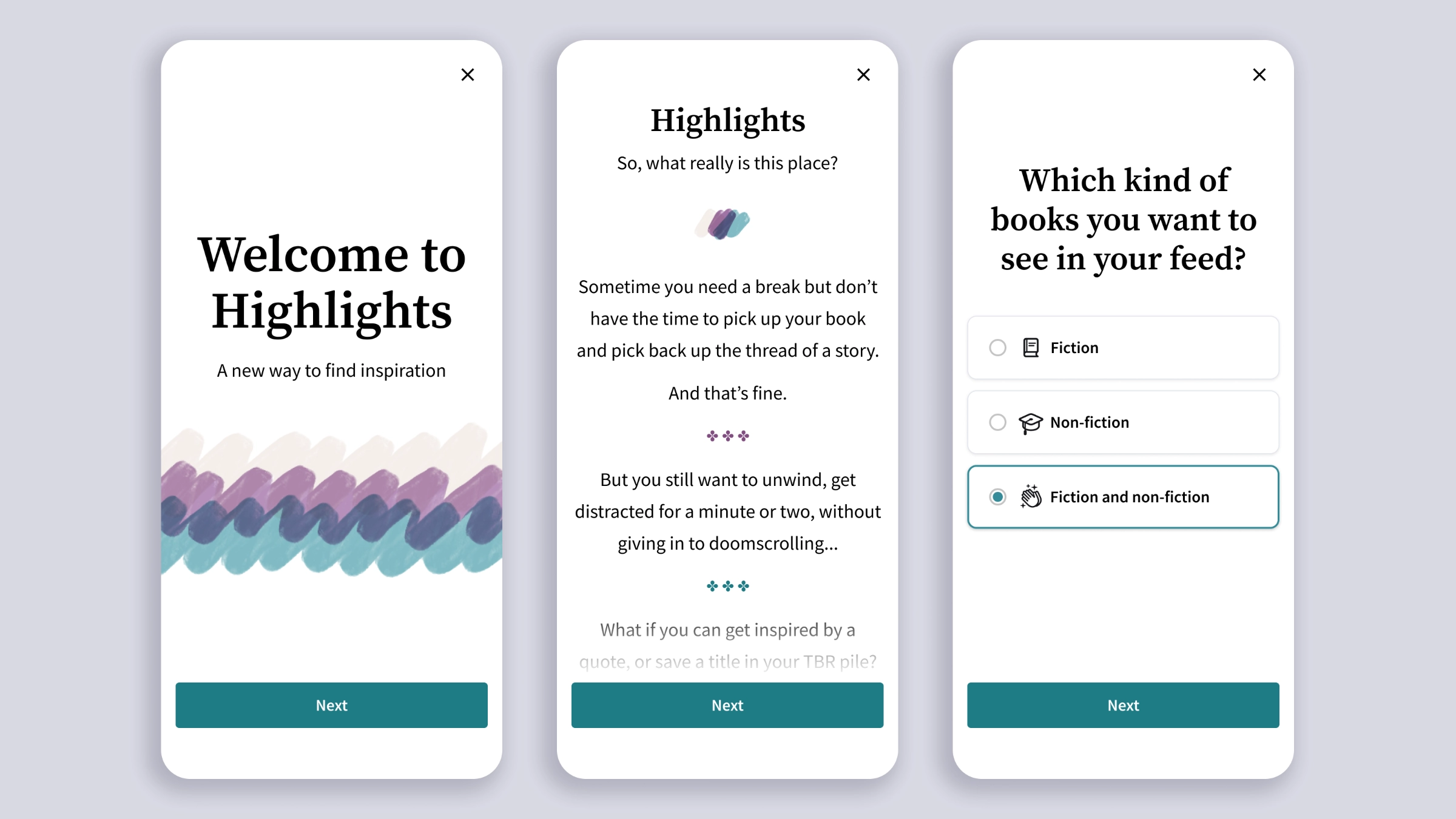
Highlights, mobile designs for a book-quotes feed
Exploring social reading as an acquisition space
A few days into my new role at Scribd, I jumped on the Hack Week wagon and joined a team with an idea that needed a designer: turning book highlights into a feed. Recently I took those early sketches and gave them more thought and time, to see what a more mature prototype could look like. If you’re into books, you know social media has its bookworm corners of influencers curating pages and recommending titles, but there isn’t anything yet uniquely dedicated to books. Scribd (now Everand) didn’t develop the idea further, but I‘m still fascinated by its potential.
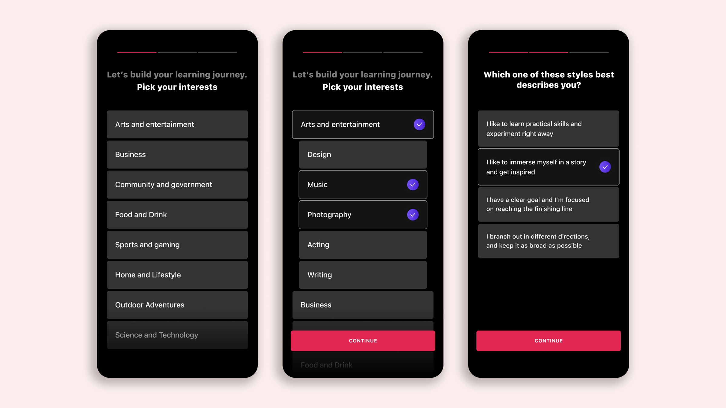
Mobile onboarding with a modular twist
Combining feature education with short-form video to increase first-day conversion
“Design is a blocker.” That’s what the Lead Mobile Engineer told me right after I joined MasterClass. My Design Manager explained that the Growth team was at capacity and we needed a solid vision for the apps’ onboarding, one that could unfold into a progression of experiments. Oh! They wanted that vision ready in two weeks. Thankfully I had solid growth and onboarding experience to draw from. My final concept brought together three elements: a compelling story to present what members got access to and convince users to subscribe; short videos to drop prospective members immediately into learning mode; and a modular approach to the narrative units composing the onboarding itself, allowing us to quickly test and measure conversion, keep the onboarding story cohesive, and have a chain of alternatives lined up for experimentation.
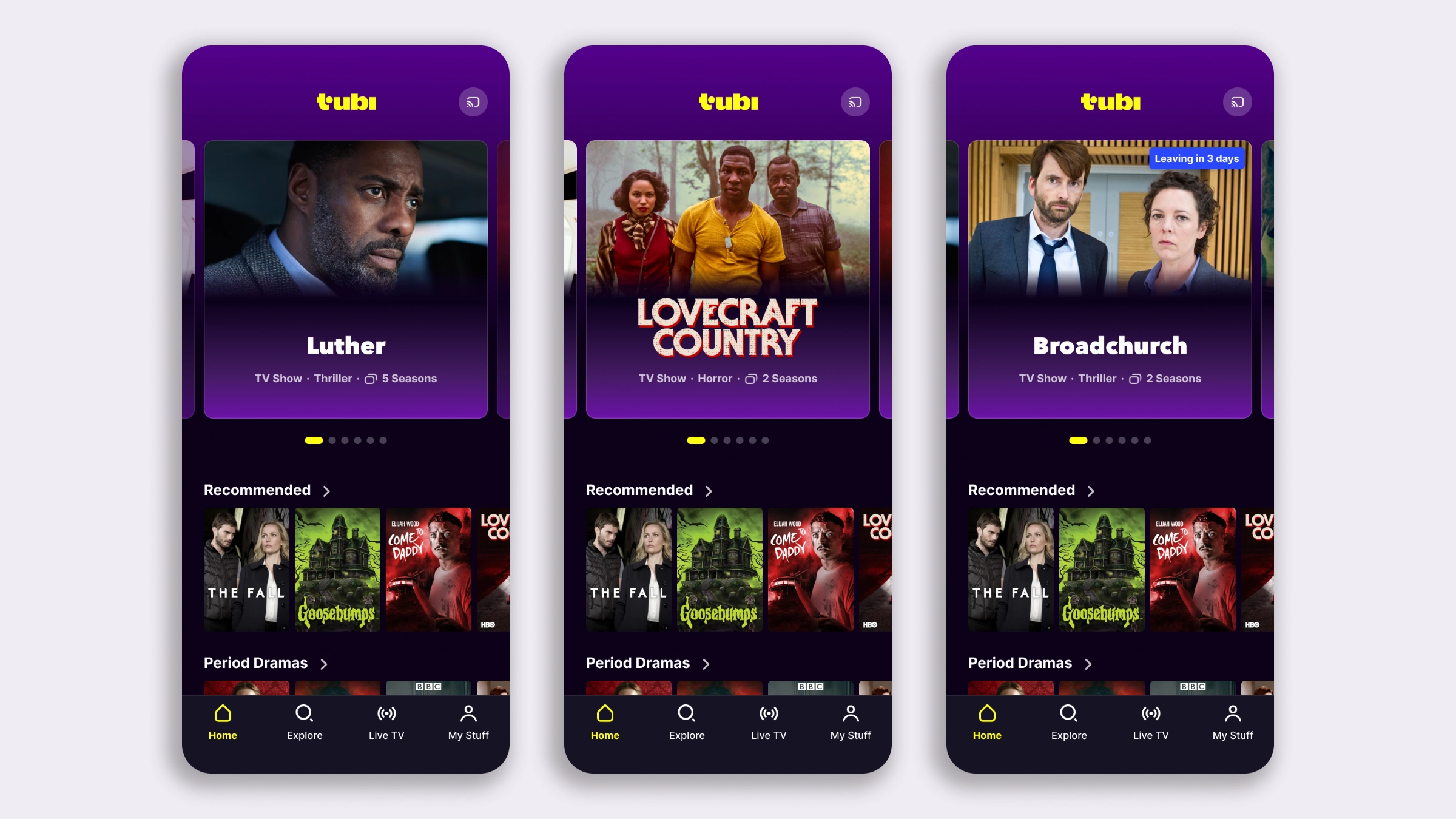
The less you browse, the more you watch
Mobile app redesign to improve content discovery and watch time
The iOS Lead Engineer at Tubi reached out to me for a self-initiated project: she had a strong conviction that the mobile experience needed work, and a green light from Product to go ahead and come up with proposals. Together we also found, and claimed, a parked ticket for increasing the visibility and discoverability of TV Series. We brought the two goals together into one project, giving the iOS and Android teams an opportunity to better sync on experiments and feature releases. My approach to this revamp is one I like and cheer for whenever I can: look at the big picture holistically, but break the design down into individual tests to build a roadmap, rather than shipping one sweeping change that’s difficult to measure. The challenge, and what I find most valuable about this method, is making sure the long-term vision holds regardless of the outcome of any individual experiment it’s made of.
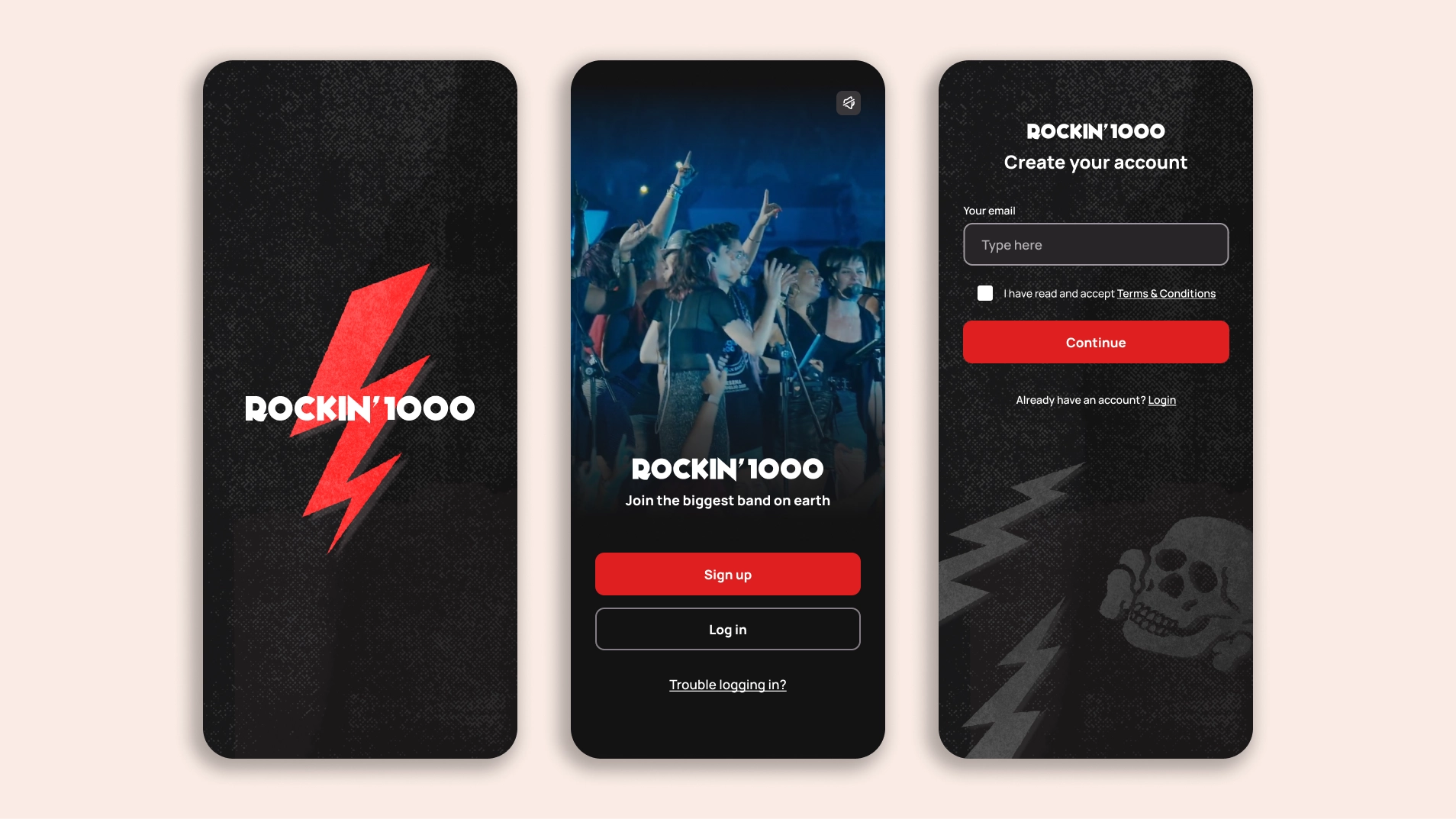
Growth design strategy for a music startup
In-depth activation flows and onboarding redesign for clarity, trust, and compliance
Rockin’1000 is a small but mighty company from Italy bringing musicians together to live their dreams: playing a stadium show with a mega-band of 1000 members from all walks of life. While they specialize in live events, they developed a mobile app for their community to stay connected and organize the shows. My business partner and I started with a redesign of the app onboarding, with the goal of reducing early churn. The work quickly expanded into something larger: we tackled all aspects of product activation, from defining the right metrics to collect, to restructuring transactional and marketing emails, to laying the foundations for a new design system library aligned with their recent rebranding.